Sunday, September 8, 2013

Regarding

I'm at the San Francisco Museum of Modern Art (or SFMOMA, as they style it), and it is Free Day. The museum will close the next day for, like, a three year renovation project, and to celebrate this they've invited the public to come see their collection for free. It is a madhouse.


A crowd gathers around Mark Rothko's No. 14, 1960, which the museum considers its prize work. They use this work more than any other to market their business. To the right, not visible in this picture, is Jackson Pollock's Guardians of the Secret

The place is packed, but it's not an unpleasant experience. It's great to see so many families running around, looking at "art." I see a lot of mothers with a couple of kids in their wake. And there is plenty of room to view the pictures. I move to the right and stand in front of Guardians for probably five minutes. I've taught this image for years, but I'd never actually seen it.

Then I move over to the Rothko. I'd visited the Rothko Chapel in Houston for the first time earlier on the trip, and I had been a little disapointed that the paintings in the chapel aren't like his classic color-field pictures. They have harder edges. Rothko's classic works are so mesmerizing because the colors bleed into each other. And the washy texture of the paint on the canvas gives the pictures surprising depth. So I stand in front of this one for a couple of minutes and soak it in before moving on. 

Later I drift back into this gallery. Standing before the Rothko, thinking about the colors and conscious of the colors I am wearing, I suddenly realize that miraculously there is no one around me and that this would make a great picture. I cross my fingers that there is some cool young person behind me whom I can just hand the camera to, and sure enough there is. He's a cool looking college-age dude, and when I ask him to take my picture, he holds up his camera and says, "I just did."


So this became the first of a series of photos of me standing in front of well-known abstract expressionist paintings. One of the cool things about all these pictures, not just the one above, is the circumstances surrounding their having been made. All of the museums where these pictures were taken allow photography, at least in their permanent collections; but of course flash photography is prohibited, and so some of the images are slightly blurry. The above image is probably the blurriest of all, but I like it. It has a Gerhard Richter feel to it. And many of the museums were as packed as the SFMOMA was that day. I visited the MoMA, in New York, on a Sunday during the summer, and it was like Times Square.


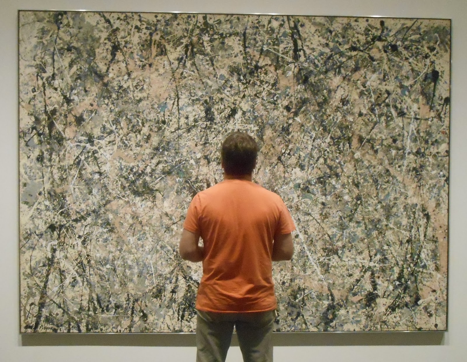
The picture on the far wall is Jackson Pollock's One: Number 31, 1950. This is probably the first painting by Pollock that really knocked me out. While most of his drip paintings adhere to the "allover" format he and the other abstract expressionists were known for, this one has a faintly discernible web of lighter colors in the center that stands apart from the rest of the composition. I noticed this center section the first time I saw this painting, as a teenager, and I always felt that Pollock called it One for two reasons: because of this center section and because he knew it was the best he'd done--as in, "This is the one."


If you look closely you can see the skeins of white paint that almost form a mandorla around my figure. This was a particularly gratifying picture to get, because the museum was packed, and also because the photographer got me standing right in the middle of the mandorla, even though I hadn't alerted her to its presence. 


Of course, the other cool thing about these photos is that I'm standing in front of some of the most famous paintings in America. This is me standing in front of Robert Motherwell's Elegy to the Spanish Republic, No. 35. Motherwell started work on this series in 1948 and continued to issue tokens from it well into the 1970s. This one (in the Metropolitan Museum of Art) dates from 1954-58, and I think it's one of his best. It really shows what the pictures are supposed to represent. The ovals are supposed to be heads, and the two verticals in the middle represent the feet of a hanged person. This picture puts the viewer in the position of the witnesses in the painting; the back of my head becomes another of the dark ovoid shapes. 

I kind of got lucky with this picture. I've always liked this series by Motherwell, but I was putting a lot of emphasis on Pollock at that point, and I was actually at the Met to see Jasper Johns's White Flag. And then here was this great example from the Elegy series. I got a quick shot before moving on to the Johns. I love the little patch of earth tone between my arm and torso.


Johns kept White Flag in his personal collection from the time he painted it in 1955 until 1998, when he sold it to the Met for an undisclosed sum of money. This was the first time I'd seen it. I'll be honest, I do think about what shirt to wear in front of each painting. The red shirt can represent the red in the American flag which is absent in this painting. It also brings out all of the different colors in the apparently monochrome painting. Johns is most often identified as a pop artist, or at least as a precursor of pop, but he is also the last great abstract expressionist. Here Johns exhibits the same "expressionistic" brush- strokes that one might find in a de Kooning. And yet the subject matter is not the painter's innermost thoughts, but the American flag. It's as if Johns is saying, you might think you're expressing your subconscious impulses, but you give away more of where you're from than you think. 

Abstract expressionism is the great American art movement, and in many ways it is the last great movement in Western painting. To this day, its practitioners stand as the epitome of the romantic artist, and that's part of what this series is about. These pictures remind me of those paintings by Caspar David Friedrich, with a solitary figure staring into the immensity of the universe. 


Which is why this picture of me striding out onto Robert Smithson's Spiral Jetty (1970) fits into the series.


But then there's also my pilgrimage to Ant Farm's Cadillac Ranch (1974), outside of Amarillo, Texas. After abstract expressionism, the art world just exploded. Anything, finally, could be art, including nine old cars half buried in the ground. Besides, there's a little bit of abstract expressionism in the spray paint on the cars. There's a little bit of pop in the bright colors and the cars themselves. And there's a little bit of surrealism in the random overlapping of words and images from a disparate group of painters.


The series is rounded out with two photos taken at the National Gallery of Art in Washington, D.C., standing in front of Pollock's Lavender Mist (1950) and Joan Mitchell's Piano mecanique (1958). 


I know that some post-modern critics will talk about these pictures in terms of the gaze. These are pictures of me looking at famous works of art. I could have just taken a picture of the works themselves, but these photos emphasize that this is my perspective, that these are the ones that I like. They also illustrate the way the paintings are meant to be viewed. The French word for "gaze," of course, is le regard. That is why this series is called Regarding. I am illustrating the act of regarding.


Sunday, May 19, 2013

Rothko Chapel / Menil Collection

I finally made it to the Rothko Chapel. I learned about this site in my first "art" history class in college, a 300-level course on modern painting, sculpture and architecture, but I had never been there until Wednesday. Before visiting the chapel I went to their website, where I learned two important pieces of information: entry to the chapel is free, and no photography is allowed on the interior. Here's an image of the exterior:


Mark Rothko (1903-1970) was an abstract expressionist painter best known for his images of floating rectangles in oil on canvas, usually very large canvasses. For example, Orange and Yellow from 1956, in the collection of the Albright-Knox Art Gallery in Buffalo, which is over seven feet tall:


(I should acknowledge that I downloaded this image from the Internet. All other photos in this blog are by me, unless otherwise noted.)

The abstract expressionists (Pollock, de Kooning, Motherwell, Rothko, et al.) were all about exploring subconscious psychological states and expressing them through (usually) nonobjective compositions. Of course, they were also working out the transformation of western painting from optical naturalism to abstraction and ultimately to the radical reduction of painting to simply paint on canvas. So that whether or not you buy the part about the expression of inner states, you can at least appreciate the work of these painters as a plausible extension of the modernist approach to painting, which had its beginnings in the middle of the nineteenth century in the works of painters like Courbet and Manet and was developed most famously by Cezanne in the late nineteenth century and Picasso in the early twentieth century. As I tell my students, you don't have to like these paintings, but you should at least understand why they happened.

Rothko wanted the viewer to stand close to his iconic late paintings and immerse herself in the emotional content of the color. It was perhaps this "spiritual" aspect of the pictures that inspired John and Dominique de Menil to commission him to decorate the interior of an ecumenical chapel they were planning to build in Houston. One of the cool things about Rothko's paintings is that the fields of color can either be experienced as hovering just above the surface of the canvas or receding indefinitely into the distance. Which is why I was a little disappointed with the canvasses in the chapel. They don't have the blurred edges of the iconic paintings, and in most cases they don't even have the floating rectangles. In every case but one, they are simply vertical rectangles of monochrome color. Some of them have a painted border about five inches wide, but this border is hard-edged and nearly the same tone as the primary field of color. Here is an interior of the chapel that I stole from the Internet:


Near the Rothko Chapel is the world-famous Menil Collection, which of course I had never visited before either. Here's a photo of the exterior:


This collection is amazing. Dominique de Menil was an heiress to the Schlumburger fortune, and the collection she and her husband put together and opened to the public in 1987 is justifiably famous for being relatively small but of extraordinarily high quality. Before I was informed that photography is not allowed in the Menil Collection as well, I was able to snap this picture of a group of Cycladic sculptures: 


I say that the collection is small, but they've actually got over 17,000 objects. What is relatively small is the exhibition space, so only a small percentage of the collection is on view at any given time. The main floor of the museum consists of a long hallway running on an east-west axis the length of the building, with six or seven self-contained exhibition spaces. I toured most of the galleries, but I'm especially drawn to modern painting, of which they have a great collection. (Though they don't have a Pollock; this road trip is turning into a search for a Pollock. NCMA didn't have a Pollock; the High didn't have a Pollock; yesterday I went to the Blanton Museum of Art at the University of Texas in Austin, and while they had some great examples from the New York School, they didn't have a Pollock, not that they were showing anyway. The Menil Collection actually has a Pollock, but it wasn't on display when I was there. I'm sure I'll find one in California, but what if I don't?)

After I was told that there was no photography allowed in the collection, I snuck another picture, this one of a Barnett Newman situated at the far end of three galleries:


I don't know who the white works in the near gallery are by, but the dark canvasses in the middle gallery are Rothkos. They are early versions of the program of paintings for the chapel, and interestingly they do have the floating rectangles with the rough edges, so one is able to get an idea of what the chapel interior would have looked like if it had been filled with iconic Rothkos. We see studies for finished works all the time in "art" history, usually drawings or sketches for finished paintings. But here we have a study in real space for a finished architectural space, and just a few hundred yards from the finished work itself.

The Menil is also known for its collection of surrealist paintings. I'm a big fan of Magritte, and they had some amazing ones, including this one:


Evening Falls (1964; downloaded image).

And this one: 


The Glass Key (1959; downloaded image). This painting was used for the cover of one of my philosophy books from college, The Myth of Sisyphus, by Albert Camus.


Here are a couple more images of the exterior of the chapel:


This is Barnett Newman's Broken Obelisk in the reflecting pool facing the entrance to the chapel. It's kind of hard to see, but perched atop the sculpture is a dove, which I flushed when I walked toward the obelisk. I thought it was fitting that the dove lighted on the sculpture since the general theme of the place is peace.

  
This is the east facade, with a door that is usually locked. I just thought it was interesting that the black rectangle of the door echoes the black rectangles on the interior.


An interesting thing happened when I was sitting in the chapel. First of all, they have all sorts of sacred texts from many world religions available for visitors' use. As I sat in the chapel I remembered that David Summers spends a few pages on the Rothko Chapel toward the end of Real Spaces. This book is basically my bible ("bible" means "book") and it is with me on this trip. I walked out to my car, got it, and sat back down in the Rothko Chapel to read David Summers' analysis of the Rothko Chapel.


Tuesday, May 14, 2013

High and "low" in Atlanta

My friend Laurie and I went to the High on Saturday. I had been before; I remembered being underwhelmed then, and I was underwhelmed this time as well. There are many holes in their collection. In the nineteenth-century American galleries, they have many Hudson River School landscapes, but very few by the big names from this group. In twentieth-century painting, they don't have a Pollock. They don't have a Johns. They don't have a Warhol. None that they were showing, anyway.

I did like this Morris Louis. It's different from his more representative works.


The visit was finally saved when I turned a corner and found this painting by Henry Ossawa Tanner (1859-1937).


It's called Etaples Fisher Folk (1923), and it exhibits Tanner's well-known facility with light. Below is a detail, which also shows how heavily impastoed the paint is.


Tanner was from Pennsylvania and studied under Thomas Eakins, but he lived most of his life in France, in the town of Etaples, in Normandy, where there was a circle of English-speaking painters. He is the first African-American to have a work in the collection of the White House (a seascape acquired during the Clinton administration). He lived briefly in Atlanta, and some of his works were bought by J. J. Haverty (1858-1939), the furniture guy who helped establish the High.


I was also struck by this landscape, by a woman named Cecilia Beaux.


I admit, I had never heard of this person, and "art" history has been notoriously remiss when it comes to including women in the canon, so it was nice to learn about this woman and see one of her works. Beaux (1855-1942) was also from Pennsylvania. This picture is called Half-Tide, Annisquam River (ca. 1905).


They also have this fun thing by Anish Kapoor, the same guy who did the bean in Chicago.


The next day, while walking the Beltline, Laurie took me to this cool place on Elizabeth Street. 


City Issue is a retro furniture store with an amazing collection of mid-century modernist works, plus some pretty cool paintings, many of which I affectionately classify as "motel art."


I really like this picture. A fellow named Kevin McQueen was manning the shop on Sunday, and he told me that this picture was painted by Paul Chelko, a painter who worked in Atlanta for many years. I told Kevin that I had just gone to the High the day before and I hadn't seen anything better than this. 


Laurie and I also came across this interesting collection at Atlantic Station.


They have a neat, clean interior . . .


. . . with a nice view of midtown Atlanta.


And there are very few holes in their collection of contemporary American "art."


Wednesday, May 8, 2013

Charlottesville, Virginia

Great meeting with David Summers in Charlottesville on Monday. David is one of the most important art historians in the country and, as regular readers of my blog know, his books, especially Real Spaces, have had a major influence on my approach to "art" and culture. I was privileged to have taken two of his seminars in graduate school at UVa, but it was through reading Real Spaces, published in 2003, that I finally came to the realization that "art" comprises all man-made objects. We spoke for over an hour in his office, and then my friend Peggy Lowe took this picture of us.


David is also a painter, and at one point during our conversation he informed me that he has a show opening at a local gallery, Les Yeux du Monde. It's in the countryside outside of Charlottesville and kind of hard to find, but boy are we glad we did. First of all, the entrance to the property is almost mystical.


And then after winding probably a good half a mile down this driveway you come across this vision of modern architecture in the middle of nowhere.


The gallery building (but not the house behind it) was desiged by W.G. Clark, best known in Charleston for the Middleton Inn and the Croffead House.


Here are some of the pictures in the exhibition, all by David Summers.


These three are part of a series called "An Investigation of the Weight of Shadows." The show is called Light, which, if you know Professor Summers and much of his scholarly work, has significance on many levels.


This one's called "Mondrian's Apricots."


This is "Mont Sainte-Victoire, Morning," which would have significance for any art historian.


And here's Peggy and me in front of the biggest painting in the show, "A Greater Net of Indra (for L.M.)."


And so, Ned's 2013 National "Art" Tour (so christened by my friend Laurie Israel; quotation marks added by me, of course) continues. I wasn't sure if I was going to blog it or not, but my first experience in Raleigh got me to thinking that I might post a blog about each museum I visit along the way. And then I have this completely serendipitous encounter in Charlottesville. I mean, the meeting with David Summers was planned, but I didn't know he had a show opening this week, and I certainly didn't expect it to be in a super cool modernist building in the Virginia hills. I wonder what other marvels I'll encounter on my journey.


Sunday, May 5, 2013

North Carolina Museum of Art

I visited the North Carolina Museum of Art in Raleigh and was thoroughly impressed. I went with three of my first cousins (once removed; our grandparents were siblings), one of whom volunteers as a docent there and has been singing the praises of this collection to me for many years.


That's Juliette Singleton on the left, and her sister, Mary Willis Cain, is the docent. The other cousin, Mary Anderson, is taking the picture. The painting in the background is by one of my favorites, Richard Diebenkorn. I look forward to seeing many Diebenkorns when I am in California, where he lived and worked.

The museum, which is owned by the people of North Carolina, has a nearly world-class collection. It is a universal survey museum with artifacts from every period of western culture, Egyptian to contemporary "art," plus a fine collection of African sculpture.


They've got a Tintoretto, The Raising of Lazarus.


It's not the best photograph, but of course I wasn't using a flash.


I really liked this picture of the seven-year-old Louis XV, from the workshop of Rigaud, precisely because it pays homage to the iconic painting of this kid's great-grandfather, Louis XIV, by Rigaud himself. And it's super well-painted and preserved. Mary Willis told me that they have a world-class conservation studio on site at the museum. 


This picture by N. C. Wyeth really knocked me out. Scrumptious.


At one point we turned the corner and saw this table and chair set.


I knew they were for sitting in, but they were so tightly placed and looked so clean that it also occured to me that they could be part of the collection. I asked Mary Willis if this was "art," and she said no. I told her that it actually was, but I don't think she heard me.


Something similar happened when we got outside.They've got an outdoor theater with lawn seating, plus a sculpture garden and a neat winding path that I wish I'd gotten a picture of. But right at the entrance to the theater is this random fire hydrant.


And my first impulse was to ask, "Who is that?" But "art" museums will do that to you.


One last word about the building. There are actually two buildings on the site. The east building is the earlier of the two, but the permanent collection is in the west building, which was completed in 2010. I am a fan of modern architure, but I have to say, this thing looks like an aircraft hangar.


But don't let it turn you off. The design has something to do with energy efficiency and allowing natural light into interior, which I have to say was really nice.