Sunday, May 19, 2013

Rothko Chapel / Menil Collection

I finally made it to the Rothko Chapel. I learned about this site in my first "art" history class in college, a 300-level course on modern painting, sculpture and architecture, but I had never been there until Wednesday. Before visiting the chapel I went to their website, where I learned two important pieces of information: entry to the chapel is free, and no photography is allowed on the interior. Here's an image of the exterior:


Mark Rothko (1903-1970) was an abstract expressionist painter best known for his images of floating rectangles in oil on canvas, usually very large canvasses. For example, Orange and Yellow from 1956, in the collection of the Albright-Knox Art Gallery in Buffalo, which is over seven feet tall:


(I should acknowledge that I downloaded this image from the Internet. All other photos in this blog are by me, unless otherwise noted.)

The abstract expressionists (Pollock, de Kooning, Motherwell, Rothko, et al.) were all about exploring subconscious psychological states and expressing them through (usually) nonobjective compositions. Of course, they were also working out the transformation of western painting from optical naturalism to abstraction and ultimately to the radical reduction of painting to simply paint on canvas. So that whether or not you buy the part about the expression of inner states, you can at least appreciate the work of these painters as a plausible extension of the modernist approach to painting, which had its beginnings in the middle of the nineteenth century in the works of painters like Courbet and Manet and was developed most famously by Cezanne in the late nineteenth century and Picasso in the early twentieth century. As I tell my students, you don't have to like these paintings, but you should at least understand why they happened.

Rothko wanted the viewer to stand close to his iconic late paintings and immerse herself in the emotional content of the color. It was perhaps this "spiritual" aspect of the pictures that inspired John and Dominique de Menil to commission him to decorate the interior of an ecumenical chapel they were planning to build in Houston. One of the cool things about Rothko's paintings is that the fields of color can either be experienced as hovering just above the surface of the canvas or receding indefinitely into the distance. Which is why I was a little disappointed with the canvasses in the chapel. They don't have the blurred edges of the iconic paintings, and in most cases they don't even have the floating rectangles. In every case but one, they are simply vertical rectangles of monochrome color. Some of them have a painted border about five inches wide, but this border is hard-edged and nearly the same tone as the primary field of color. Here is an interior of the chapel that I stole from the Internet:


Near the Rothko Chapel is the world-famous Menil Collection, which of course I had never visited before either. Here's a photo of the exterior:


This collection is amazing. Dominique de Menil was an heiress to the Schlumburger fortune, and the collection she and her husband put together and opened to the public in 1987 is justifiably famous for being relatively small but of extraordinarily high quality. Before I was informed that photography is not allowed in the Menil Collection as well, I was able to snap this picture of a group of Cycladic sculptures: 


I say that the collection is small, but they've actually got over 17,000 objects. What is relatively small is the exhibition space, so only a small percentage of the collection is on view at any given time. The main floor of the museum consists of a long hallway running on an east-west axis the length of the building, with six or seven self-contained exhibition spaces. I toured most of the galleries, but I'm especially drawn to modern painting, of which they have a great collection. (Though they don't have a Pollock; this road trip is turning into a search for a Pollock. NCMA didn't have a Pollock; the High didn't have a Pollock; yesterday I went to the Blanton Museum of Art at the University of Texas in Austin, and while they had some great examples from the New York School, they didn't have a Pollock, not that they were showing anyway. The Menil Collection actually has a Pollock, but it wasn't on display when I was there. I'm sure I'll find one in California, but what if I don't?)

After I was told that there was no photography allowed in the collection, I snuck another picture, this one of a Barnett Newman situated at the far end of three galleries:


I don't know who the white works in the near gallery are by, but the dark canvasses in the middle gallery are Rothkos. They are early versions of the program of paintings for the chapel, and interestingly they do have the floating rectangles with the rough edges, so one is able to get an idea of what the chapel interior would have looked like if it had been filled with iconic Rothkos. We see studies for finished works all the time in "art" history, usually drawings or sketches for finished paintings. But here we have a study in real space for a finished architectural space, and just a few hundred yards from the finished work itself.

The Menil is also known for its collection of surrealist paintings. I'm a big fan of Magritte, and they had some amazing ones, including this one:


Evening Falls (1964; downloaded image).

And this one: 


The Glass Key (1959; downloaded image). This painting was used for the cover of one of my philosophy books from college, The Myth of Sisyphus, by Albert Camus.


Here are a couple more images of the exterior of the chapel:


This is Barnett Newman's Broken Obelisk in the reflecting pool facing the entrance to the chapel. It's kind of hard to see, but perched atop the sculpture is a dove, which I flushed when I walked toward the obelisk. I thought it was fitting that the dove lighted on the sculpture since the general theme of the place is peace.

  
This is the east facade, with a door that is usually locked. I just thought it was interesting that the black rectangle of the door echoes the black rectangles on the interior.


An interesting thing happened when I was sitting in the chapel. First of all, they have all sorts of sacred texts from many world religions available for visitors' use. As I sat in the chapel I remembered that David Summers spends a few pages on the Rothko Chapel toward the end of Real Spaces. This book is basically my bible ("bible" means "book") and it is with me on this trip. I walked out to my car, got it, and sat back down in the Rothko Chapel to read David Summers' analysis of the Rothko Chapel.


Tuesday, May 14, 2013

High and "low" in Atlanta

My friend Laurie and I went to the High on Saturday. I had been before; I remembered being underwhelmed then, and I was underwhelmed this time as well. There are many holes in their collection. In the nineteenth-century American galleries, they have many Hudson River School landscapes, but very few by the big names from this group. In twentieth-century painting, they don't have a Pollock. They don't have a Johns. They don't have a Warhol. None that they were showing, anyway.

I did like this Morris Louis. It's different from his more representative works.


The visit was finally saved when I turned a corner and found this painting by Henry Ossawa Tanner (1859-1937).


It's called Etaples Fisher Folk (1923), and it exhibits Tanner's well-known facility with light. Below is a detail, which also shows how heavily impastoed the paint is.


Tanner was from Pennsylvania and studied under Thomas Eakins, but he lived most of his life in France, in the town of Etaples, in Normandy, where there was a circle of English-speaking painters. He is the first African-American to have a work in the collection of the White House (a seascape acquired during the Clinton administration). He lived briefly in Atlanta, and some of his works were bought by J. J. Haverty (1858-1939), the furniture guy who helped establish the High.


I was also struck by this landscape, by a woman named Cecilia Beaux.


I admit, I had never heard of this person, and "art" history has been notoriously remiss when it comes to including women in the canon, so it was nice to learn about this woman and see one of her works. Beaux (1855-1942) was also from Pennsylvania. This picture is called Half-Tide, Annisquam River (ca. 1905).


They also have this fun thing by Anish Kapoor, the same guy who did the bean in Chicago.


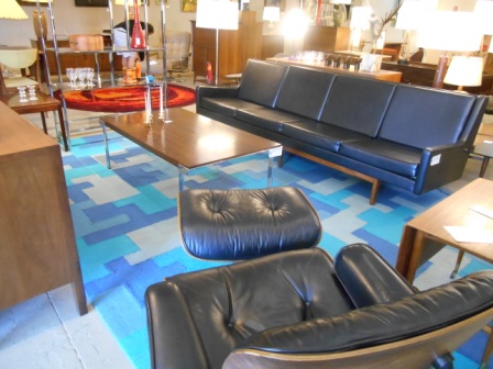
The next day, while walking the Beltline, Laurie took me to this cool place on Elizabeth Street. 


City Issue is a retro furniture store with an amazing collection of mid-century modernist works, plus some pretty cool paintings, many of which I affectionately classify as "motel art."


I really like this picture. A fellow named Kevin McQueen was manning the shop on Sunday, and he told me that this picture was painted by Paul Chelko, a painter who worked in Atlanta for many years. I told Kevin that I had just gone to the High the day before and I hadn't seen anything better than this. 


Laurie and I also came across this interesting collection at Atlantic Station.


They have a neat, clean interior . . .


. . . with a nice view of midtown Atlanta.


And there are very few holes in their collection of contemporary American "art."


Wednesday, May 8, 2013

Charlottesville, Virginia

Great meeting with David Summers in Charlottesville on Monday. David is one of the most important art historians in the country and, as regular readers of my blog know, his books, especially Real Spaces, have had a major influence on my approach to "art" and culture. I was privileged to have taken two of his seminars in graduate school at UVa, but it was through reading Real Spaces, published in 2003, that I finally came to the realization that "art" comprises all man-made objects. We spoke for over an hour in his office, and then my friend Peggy Lowe took this picture of us.


David is also a painter, and at one point during our conversation he informed me that he has a show opening at a local gallery, Les Yeux du Monde. It's in the countryside outside of Charlottesville and kind of hard to find, but boy are we glad we did. First of all, the entrance to the property is almost mystical.


And then after winding probably a good half a mile down this driveway you come across this vision of modern architecture in the middle of nowhere.


The gallery building (but not the house behind it) was desiged by W.G. Clark, best known in Charleston for the Middleton Inn and the Croffead House.


Here are some of the pictures in the exhibition, all by David Summers.


These three are part of a series called "An Investigation of the Weight of Shadows." The show is called Light, which, if you know Professor Summers and much of his scholarly work, has significance on many levels.


This one's called "Mondrian's Apricots."


This is "Mont Sainte-Victoire, Morning," which would have significance for any art historian.


And here's Peggy and me in front of the biggest painting in the show, "A Greater Net of Indra (for L.M.)."


And so, Ned's 2013 National "Art" Tour (so christened by my friend Laurie Israel; quotation marks added by me, of course) continues. I wasn't sure if I was going to blog it or not, but my first experience in Raleigh got me to thinking that I might post a blog about each museum I visit along the way. And then I have this completely serendipitous encounter in Charlottesville. I mean, the meeting with David Summers was planned, but I didn't know he had a show opening this week, and I certainly didn't expect it to be in a super cool modernist building in the Virginia hills. I wonder what other marvels I'll encounter on my journey.


Sunday, May 5, 2013

North Carolina Museum of Art

I visited the North Carolina Museum of Art in Raleigh and was thoroughly impressed. I went with three of my first cousins (once removed; our grandparents were siblings), one of whom volunteers as a docent there and has been singing the praises of this collection to me for many years.


That's Juliette Singleton on the left, and her sister, Mary Willis Cain, is the docent. The other cousin, Mary Anderson, is taking the picture. The painting in the background is by one of my favorites, Richard Diebenkorn. I look forward to seeing many Diebenkorns when I am in California, where he lived and worked.

The museum, which is owned by the people of North Carolina, has a nearly world-class collection. It is a universal survey museum with artifacts from every period of western culture, Egyptian to contemporary "art," plus a fine collection of African sculpture.


They've got a Tintoretto, The Raising of Lazarus.


It's not the best photograph, but of course I wasn't using a flash.


I really liked this picture of the seven-year-old Louis XV, from the workshop of Rigaud, precisely because it pays homage to the iconic painting of this kid's great-grandfather, Louis XIV, by Rigaud himself. And it's super well-painted and preserved. Mary Willis told me that they have a world-class conservation studio on site at the museum. 


This picture by N. C. Wyeth really knocked me out. Scrumptious.


At one point we turned the corner and saw this table and chair set.


I knew they were for sitting in, but they were so tightly placed and looked so clean that it also occured to me that they could be part of the collection. I asked Mary Willis if this was "art," and she said no. I told her that it actually was, but I don't think she heard me.


Something similar happened when we got outside.They've got an outdoor theater with lawn seating, plus a sculpture garden and a neat winding path that I wish I'd gotten a picture of. But right at the entrance to the theater is this random fire hydrant.


And my first impulse was to ask, "Who is that?" But "art" museums will do that to you.


One last word about the building. There are actually two buildings on the site. The east building is the earlier of the two, but the permanent collection is in the west building, which was completed in 2010. I am a fan of modern architure, but I have to say, this thing looks like an aircraft hangar.


But don't let it turn you off. The design has something to do with energy efficiency and allowing natural light into interior, which I have to say was really nice.


Friday, February 22, 2013

And the Loser Is . . .

I want to just note from the start that I have since come around on No Country for Old Men.Ned, 2026 

The Academy Awards are largely full of crap. Every so often the winners are chosen based on merit, but more often than not they appear to have been chosen based on who ought to win rather than on which films and performances were the most skillfully produced and culturally important.


The awards from two years ago offer a perfect illustration of this tendency. The winner for best picture, The King's Speech, was a spiritless account of the speech impediment suffered by the future George VI which seemed more to poke fun at the man's affliction than to seriously explore its nature and the struggle to overcome it. The Social Network, on the other hand, was a dynamic exegesis of the birth of one of the most influential media formats of the current age, featuring many of the best young actors of our time, written by one of the best screenwriters of our time, fascinatingly edited and with awesome music. It did win Oscars for these last three categories, but The King's Speech won for best picture because it had "art" written all over it. Its content was "highbrow," as opposed to the "lowbrow" subject matter of Facebook, and the single image that I take away from The King's Speech is the shot, repeated at least once, of Colin Firth sitting in front of a large wall of peeling paint evocative of an abstract painting ("art"). 

For every Shakespeare in Love, there are plenty of films like Million Dollar Baby, Braveheart and Ordinary People. I group these together because they illustrate the Academy's history of rewarding actors-turned-directors. There's also the tradition of the make-up prize. A good example in this category is The Departed, which was Martin Scorsese's make-up award after his two best films, Raging Bull and GoodFellas, were famously snubbed by the Academy. It should be noted that each of these films lost to films directed by actors: Raging Bull to Ordinary People, and GoodFellas to Dances with Wolves (Kevin Costner).

And then there's No Country for Old Men, which is not even the Coen brothers' sixth best movie. 1 Fargo. 2 Raising Arizona. 3 O Brother, Where Art Thou? 4 The Big Lebowski. 5 Miller's Crossing. 6 A Serious Man. Hell, 7 Blood Simple might be better, but, again, No Country just oozes "art," in this case by virtue of being completely incomprehensible. (One gets the idea that the Coen brothers were well aware of the fact that No Country was classic Oscar bait when they made it the first film produced and directed by both brothers, hence Academy Awards for each.)

I definitely wouldn't call Schindler's List a make-up award, but Steven Spielberg knew he had to make something high-minded in order to get an Oscar, no matter how great Jaws, Close Encounters of the Third Kind, Raiders of the Lost Ark and E.T. were. (They did give him the Irving G. Thalberg Memorial Award in 1987, but that was a make-up award, and it ain't an Oscar.) Paul Newman's Oscar for The Color of Money was a make-up award, making up for too many performances to even count, Cool Hand Luke. Paul Newman was simply too good-looking to be recognized in his prime. For pretty people to win an Oscar they have to ugly themselves up. Charlize Theron knows it; Nicole Kidman nose it. 

Two years ago the Academy could have given David Fincher a make-up award for Se7en, Fight Club and Zodiac. This year they may be inclined to recognize Ben Affleck and Argo in the actor-turned-director category. This wouldn't be such a crime, since Argo is a super movie. But they might try to kill two birds with one stone and go with Silver Linings Playbook, as a make-up prize for David O. Russell (Three Kings, I Heart Huckabees and The Fighter) and for "tackling" an important issue (cf. Million Dollar Baby, vis-a-vis euthanasia). But as with The King's Speech, Playbook doesn't really appear interested in thoughtfully examining its lead characters' malady (bipolar disorder). The movie is a mess, and Robert De Niro stands a good chance of getting some kind of "we still love you" award for supporting actor, even though the bookie he plays doesn't act like any bookie I've ever talked to. 

It remains to be seen if and when the Academy of Motion Picture Arts and Sciences will slip into irrelevancy like so many academies in the past. For now the Oscars continue to exert an enormous influence on the culture in terms of what passes for "art" in the film world. And the loser is . . .

Monday, December 3, 2012

All tools are works of "art"; all works of "art" are tools.


Our position in the history of what art has been thought to be makes it difficult to appreciate
the importance of technology for art, since we are predisposed to believe that to the degree that artifacts are technological they are not art at all. In broader terms, however, technology is
always the more or less immediate background for everything we call art, and from a
historical point of view the link between techne and art cannot be broken. We eliminate fundamentally significant avenues of historical understanding when we separate and oppose them.—David Summers, Real Spaces


Over and over in my years of teaching "art" history, I have heard students say that they don’t know much about "art." My initial response is to ask if they ever go to the movies, or play video games, or surf the Internet. On the first day of classes each semester I conduct an exercise intended to answer the question, "What is 'art'?" I ask the students to name different "art" forms, and I write these on the whiteboard as they call them out. Inevitably the traditional media are the first to be offered: painting, sculpture, drawing, architecture, dance, literature, music. Photography usually pops up pretty early. Some bold students will then begin to suggest such areas as fashion, cooking, graphic design and even tattoos. Movies eventually get recognized, and video games are finally not far behind. It is obvious that the students are initially giving me what they think I want to hear, which is natural, and then as they begin to recognize my openness to media that their generation is more familiar with, they begin to offer these up.

Still, each time I conduct this exercise many vital contemporary media are consistently left off the list. Movies are identified, but rarely television shows. Graphic design, but never web pages (or computers, for that matter). Skateboards and surfboards, but never cars. When I ask whether a car is a work of "art," the frequent response is, "It can be," by which is meant that a car is a work of "art" when an emphasis has been placed on how it looks, on its design elements, over its functional elements. "So a tricked-out Charger is a work of 'art'," I say to them, "but my Corolla is not." This usually draws a laugh or two, along with nods of agreement. (What can I say? As all veteran teachers know, it helps to keep them entertained!) It is usually at this point that I cut to the chase and let them know that all man-made objects are works of "art." Cars and computers and television commercials are usually left off the list because they are technological, and in this culture we generally make a distinction between technology and "art." Here I point their attention to the above quote from "art" historian David Summers which I have included in my syllabus from the very first class I taught. Basically he says you can’t separate technology from "art," not in the pre-modern world, and not now.

 Renaissance painters were the masters of bustling workshops working at the cutting edge of technology. The master and his assistants weren’t called "artists" the way we use the term today but were considered more what we would call craftsmen. And while much of what they created is today found in museums, these objects were originally created for specific spaces with specific functions. A Renaissance altarpiece, for example, was made as a visual aid for a largely illiterate population, and anyway the liturgy was in Latin. As a modern equivalent to the Renaissance altarpiece, I encourage my students to consider the video screen behind the performers at a rock concert or, on a more prosaic level, the PowerPoint presentation I use to present this lecture. Perhaps because painting was the dominant technology in the visual medium for so long, painting is the format most commonly identified with "art" today. But the dominant visual formats today are certainly film, television and "new media" associated with the Internet and related technologies. And, of course, these are often created in bustling workshops using the very latest technology. I remind my students to think of all the names listed in the credits that roll at the end of a movie.

It’s the first day of classes, so I don’t ask them to take too many notes. But this I ask them to write down: All man-made objects are works of "art." All tools are works of "art," and all works of "art" are tools. I tell them that all of the objects we’ll study, from the Law Code of Hammurabi to the Arena Chapel and beyond were first and foremost utilitarian. They were made to serve a particular purpose, and in this way they can be considered tools. Even objects created after the rise of the notion of the "fine arts" in the eighteenth century must, from a historian’s point of view, be evaluated not so much in terms of how they look but how and why they were made. The confusion arises from the historical reality that the discipline of "art" history came into existence placing a strong emphasis on form (or style), and this emphasis continues to influence the practice of "art" history, as well as the popular notion of what "art" is, to the present day. Works of "art" are said to be fundamentally composed of form and content. Form quite simply is the way an object looks. In painting, form refers to color, line, shape, etc. Content may be more accurately referred to as subject matter, but the binary trope of form and content is firmly established in our cultural lexicon. And the popular notion of "art" refers to those objects which are created with an emphasis on form, so that even some paintings (like, perhaps, those of Jim Harrison) are often not considered "art," or at least not "fine art," because the emphasis is on subject matter. But all man-made objects exist on a continuum with form on one end and content on the other, and objects that are pure form or pure content exist, to borrow a phrase from E. H. Gombrich, only in the imagination. 

It must be acknowledged that the rhetorical dichotomy of form and content was conceived with regard to the visual arts, and this dichotomy must be reexamined when we broaden the scope of what we consider "art." Even if the student is not yet ready to accept a pair of channel locks into the domain of "art," she must recognize that museums are filled with utility objects, from suits of armor at the Met to helicopters at MoMA. It may be easy to identify the subject matter of Nighthawks, but what exactly is the subject matter of a suit of armor?

On the continuum of form and content, style is equated with form and subject matter is equated with content. In the all-inclusive definition of "art" we can place design on the side of form, and on the side of content we can place function. The function of a Renaissance altarpiece is to add to the observers’ understanding of the tenets of Christianity, and this is primarily accomplished through subject matter. (Form, of course, can enhance this function.) This approach also allows us to determine the "subject matter" of a "purely formal" work of "art," like the drip paintings of Jackson Pollock. There may be no recognizable subject matter in these paintings but, as I remind my students every year, nobody does anything in this world for nothing. These pictures were painted at the very least to decorate a wall. On a potentially more profound level, they were painted to express an idea. And, truth be told, they were also painted to be offered for sale. Each of these things may be what the paintings are about, which is a synonym for subject matter. (When we ask what a movie or a book is about, we mean, "What is the subject matter?")

Now, in the case of the channel locks, it appears that design and function are inextricably bound, that there is no daylight between the two. Channel locks must be designed the way they are in order to function as they and only they do. But what about channel locks with pink grips? What is the function of the pink grips? The pink grips serve to indicate that these channel locks are for the ladies. I ask my students to think about the clothes they wear. What is the function of clothing? The function of clothing is to protect us from the elements and to cover up our private parts. But there are different styles of dress—there are different fashions—and they are not merely decorative. They have a function. The way we dress identifies the subculture we wish to be associated with: businessman, hipster doofus, goth, skater chick. No clothes, no matter how plain, are pure function; and no clothes, no matter how ostentatious, are pure form.

The example I close with is that of the book. Broadly speaking, there are two types of books: nonfiction and fiction. For the sake of argument, let’s narrow it down to the textbook and the novel.  Between the two, the novel is the one more commonly considered "art." The textbook is considered a utility object. The textbook is more concerned with subject matter and the novel is more concerned with form.  The writer of the textbook wishes to impart information in the clearest manner possible, while the novelist may wish to present a more complex narrative and experiment with language. On the continuum of form and function, the textbook typically trends more toward the function end and the novel trends more toward the form end. But even a textbook should be well-written, and the best novels are going to teach us something. And a well-written textbook is better than a bad novel. But better isn't what makes a thing "art." "Art" cannot be synonymous with beauty (good form), because beauty famously resides in the eye of the beholder.  I’m often asked, "When does a thing become 'art'?" The answer is, "The minute it is created."

I place the word "art" in quotation marks because it is a term so broad as to be virtually devoid of meaning. In the classroom, believe it or not, I try not to use the word "art." I prefer to call each medium by its name: painting, filmmaking, mechanical engineering, what have you. I am amused when I visit a bookstore and see sections for literature, history, biography, self-help, and then I see a section for "art." This would be comparable (to channel Gilbert Ryle) to visiting a college campus and seeing buildings for humanities, sciences, journalism, athletics, and then seeing a building marked "university." It’s all the university. And it’s all "art."
 

Sunday, June 3, 2012

Series


All man-made objects are more or less conventional. When we first set out to create a thing, many of our decisions are already made for us. If we wish to make a feature film, the format is pretty much already decided for us. In terms of content, we’re most likely going to present a narrative in which characters interact through dialogue, facial expression, and body language; we may cut between certain scenes for dramatic effect; we may present montages of activity to show the passage of time or the development of a relationship; we may introduce secondary characters; and ideally there should be a conflict that gets resolved. These are some of the conventions of the feature film. Even if we introduce certain unconventional elements in the hope of setting our film apart from others of its kind, we must nevertheless work largely within the conventions of the feature film, otherwise our work simply will not be recognized as a feature film.

Take the 1994 film Pulp Fiction. This was regarded as a relatively unconventional film, with its non-linear narrative, harsh lighting, fragmented title sequence and self-referential characters. And yet it was filmed in Hollywood with recognizable actors, shot on film, edited to a standard length, distributed to theaters and is altogether recognizable as a feature film.  

Another way of articulating this concept is to say that all man-made objects belong to various series. Pulp Fiction belongs to the series of feature films; another example from this series is Citizen Kane. Pulp Fiction belongs to the series of movies about gangsters; another film in this series is White Heat. Pulp Fiction belongs to the series of gangster movies that glamorize the main characters even as they are depicted committing horrible acts of violence; another movie in this series is Bonnie and Clyde. Pulp Fiction belongs to the series of movies containing a MacGuffin, a series which would include any number of Alfred Hitchcock films. Pulp Fiction is a buddy movie, in the same series as Butch Cassidy and the Sundance Kid. Pulp Fiction belongs to the series of, well, pulp fiction, a series exemplified by writers like Dashiell Hammett and Elmore Leonard. And Pulp Fiction belongs to the series of films in which the main characters make frequent reference to elements of popular culture. This was another of the unconventional aspects of Pulp Fiction and can be seen as having initiated a new series, one which would seem to include pretty much every Hollywood movie from Get Shorty to Men in Black III (which I haven’t seen).

The purpose of such an exercise is to place an object in its historical context. This exercise is also employed in the practice of authentication. Say I come across something at a yard sale that looks like a late medieval altarpiece and I want to know whether it’s worth a hundred million dollars or not. I’m going to try to determine what series it belongs to. It obviously belongs to most of the series associated with late medieval altarpieces, otherwise I wouldn’t have entertained the notion of its being such an artifact. But when I look closer I find that it does not belong to the series of objects made of wood, and it does not belong to the series of images painted in tempera with gold leaf. It belongs to the series of objects made of pressboard and painted in acrylic, neither of which existed in the Middle Ages.

We have a tendency to think of painting, sculpture, printmaking and the like as "art" because these were for so long the dominant formats. Before the twentieth century, these were the formats that constituted the broad series of "art," and we continue to place contemporary examples of these formats into this series. The painting of former president George W. Bush that was recently unveiled at the White House belongs to the series of paintings produced in oil on canvas. Another example from this series would be Rigaud’s iconic portrait of Louis XIV. Of course, these paintings also belong to the series of state portraits. But the Bush portrait does not belong to another important series that the Rigaud portrait does belong to, namely state portraits produced in the dominant format of a given period in history. A contemporary example from this series would be a campaign video, something we are not typically inclined to call "art." (And while a campaign ad would be inappropriate for a White House portrait, it is possible to imagine future state portraits being presented in the video format.)

Most of the objects that we learn about in "art" history belong to the series of things found in museums, and so again we tend to believe that only things resembling those found in museums are "art." But none of these objects was initially intended to be viewed in a museum. Each was created for a specific function, usually in the context of a highly developed social space. Raphael’s School of Athens and related frescoes were not intended simply as decorations on the walls of the pope’s library. They were expressly conceived to present a specific ideology, and they were produced using the conventional technique of the day (linear perspective). Another object belonging to this series is The Social Network. This artifact obviously uses the conventional technique of our day (film); each of these techniques, incidentally, belongs to the series of technological advances based on the science of optics.

The persistent objection to the inclusion of campaign ads and popular feature films in the category of "art" is (among others) their perceived lack of personal expression. But emphasis on personal expression engenders the most self-indulgent nonsense that is only taken seriously because an ancient authority retains some interest in identifying it and only it as "art," to the exclusion of other, often more vital formats. We’ve actually seen this movie before. All the films, television shows, advertisements, web pages and the rest that are not considered "art" today belong to the same series as the paintings of Courbet, Manet and the Impressionists that were rejected by the academy in another place and time.